Miròs
BRAND IDENTITY & PACKAGING FOR A cosmetic brand
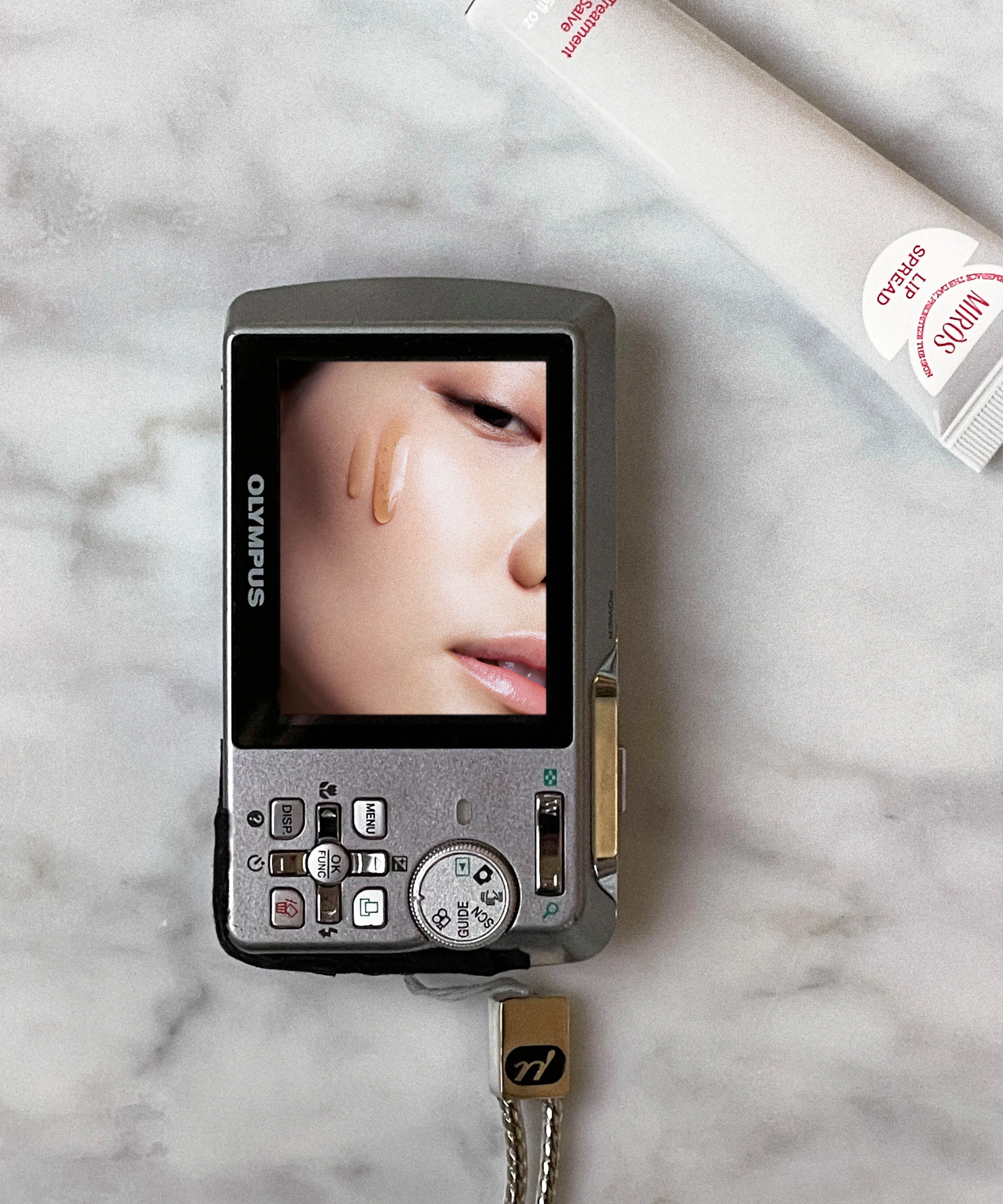
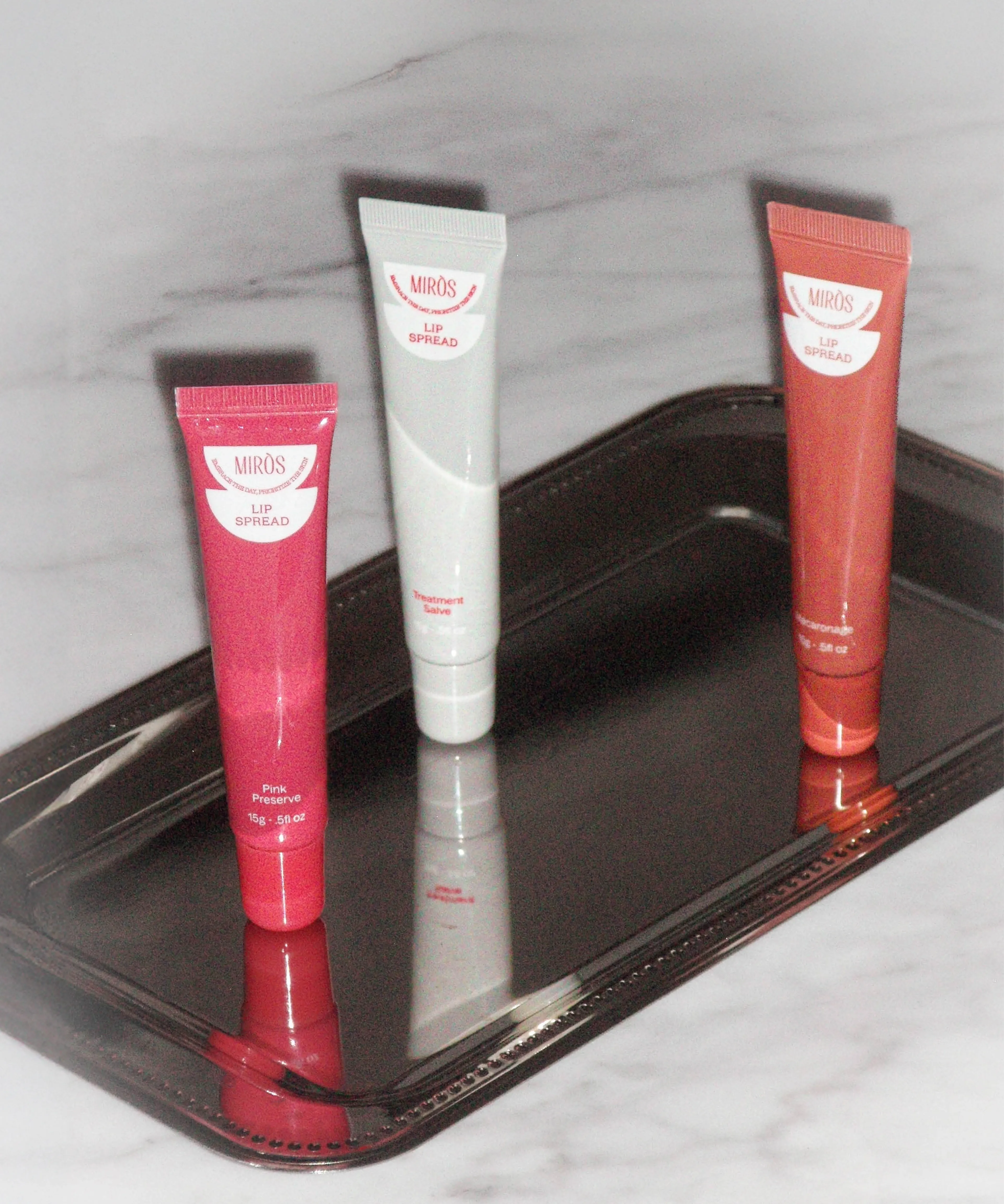
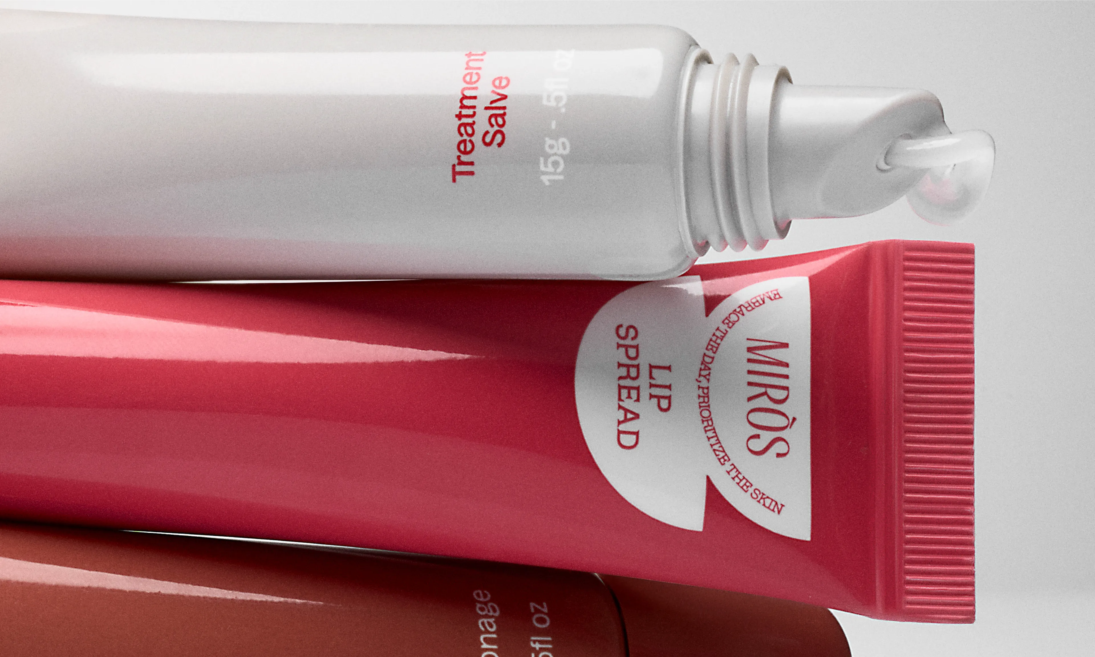
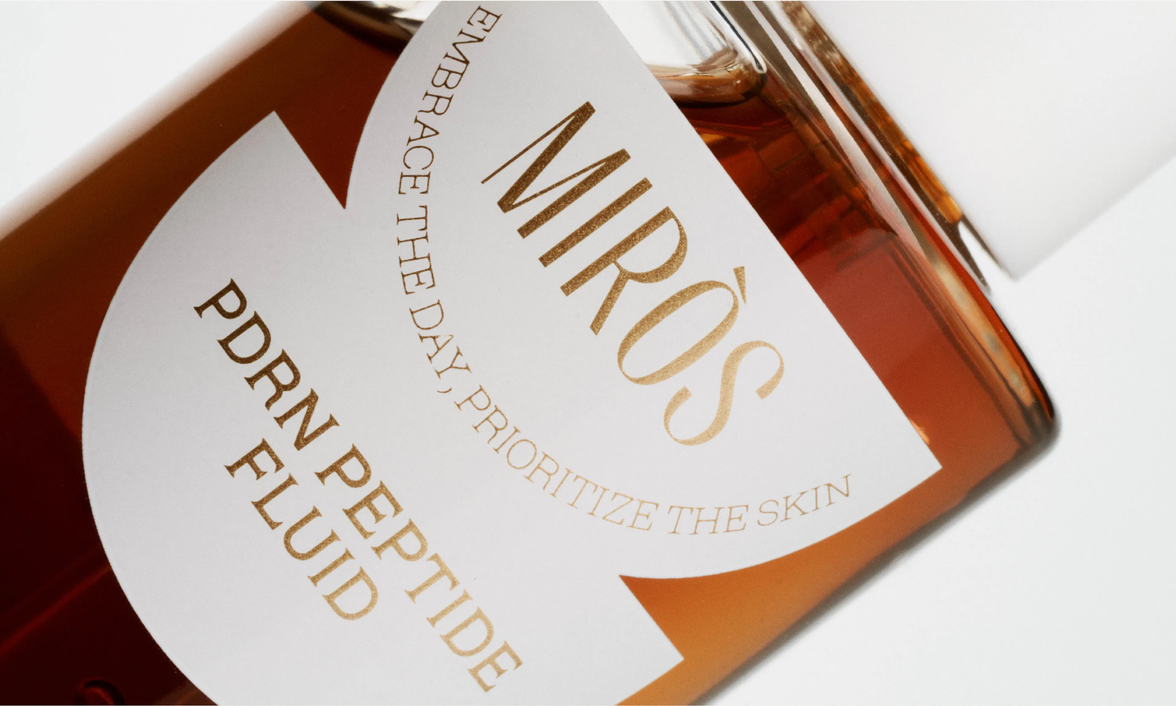
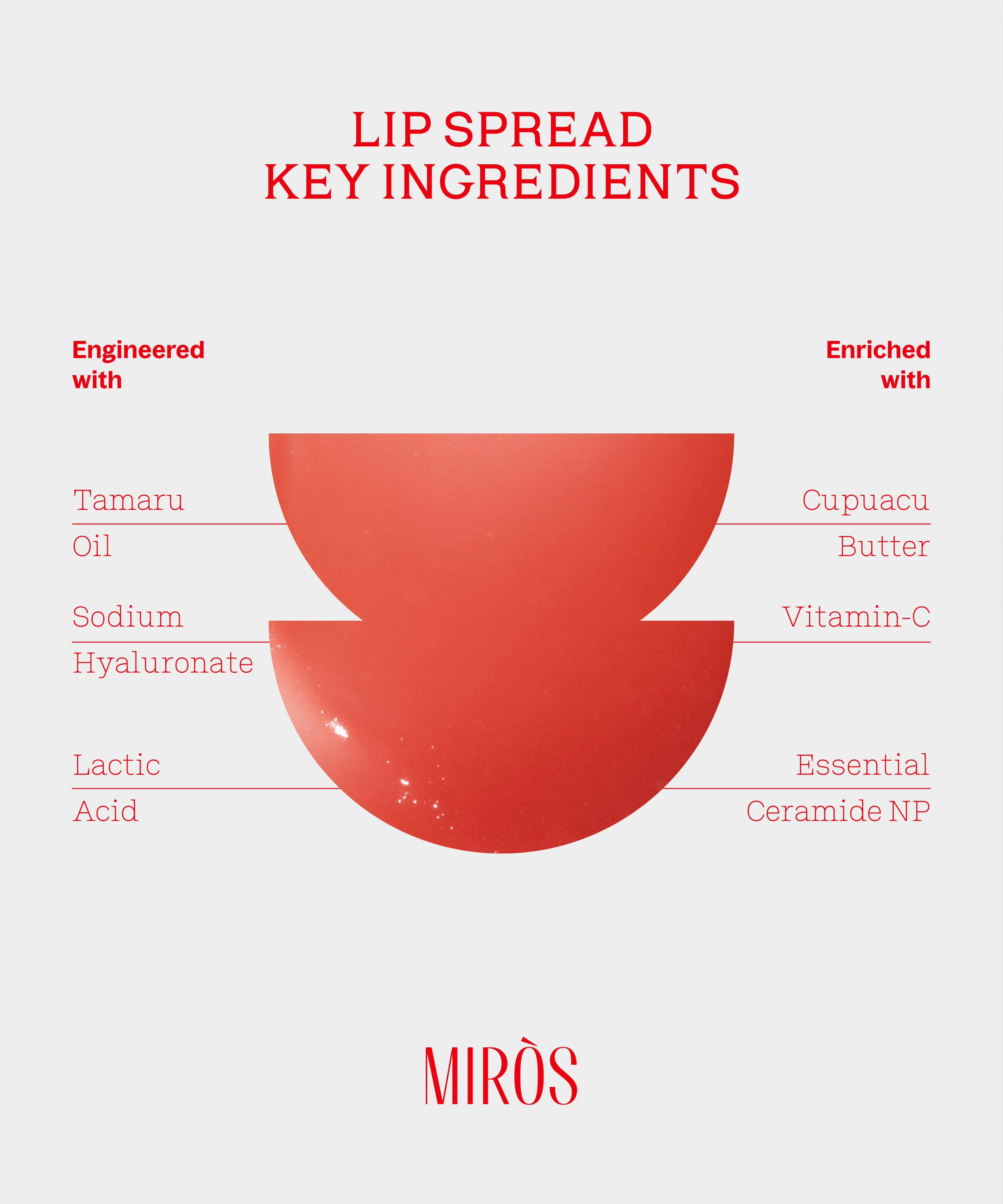
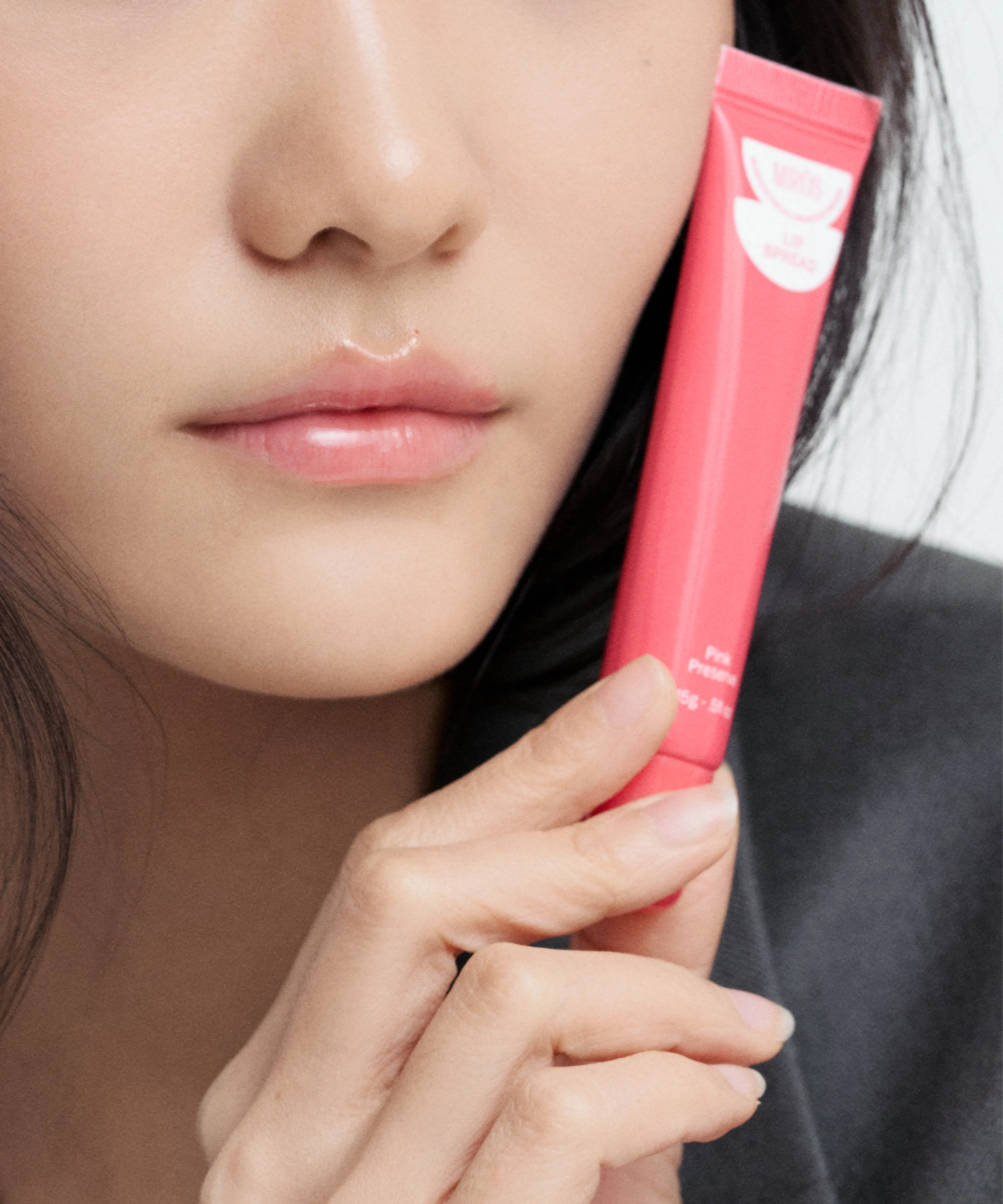
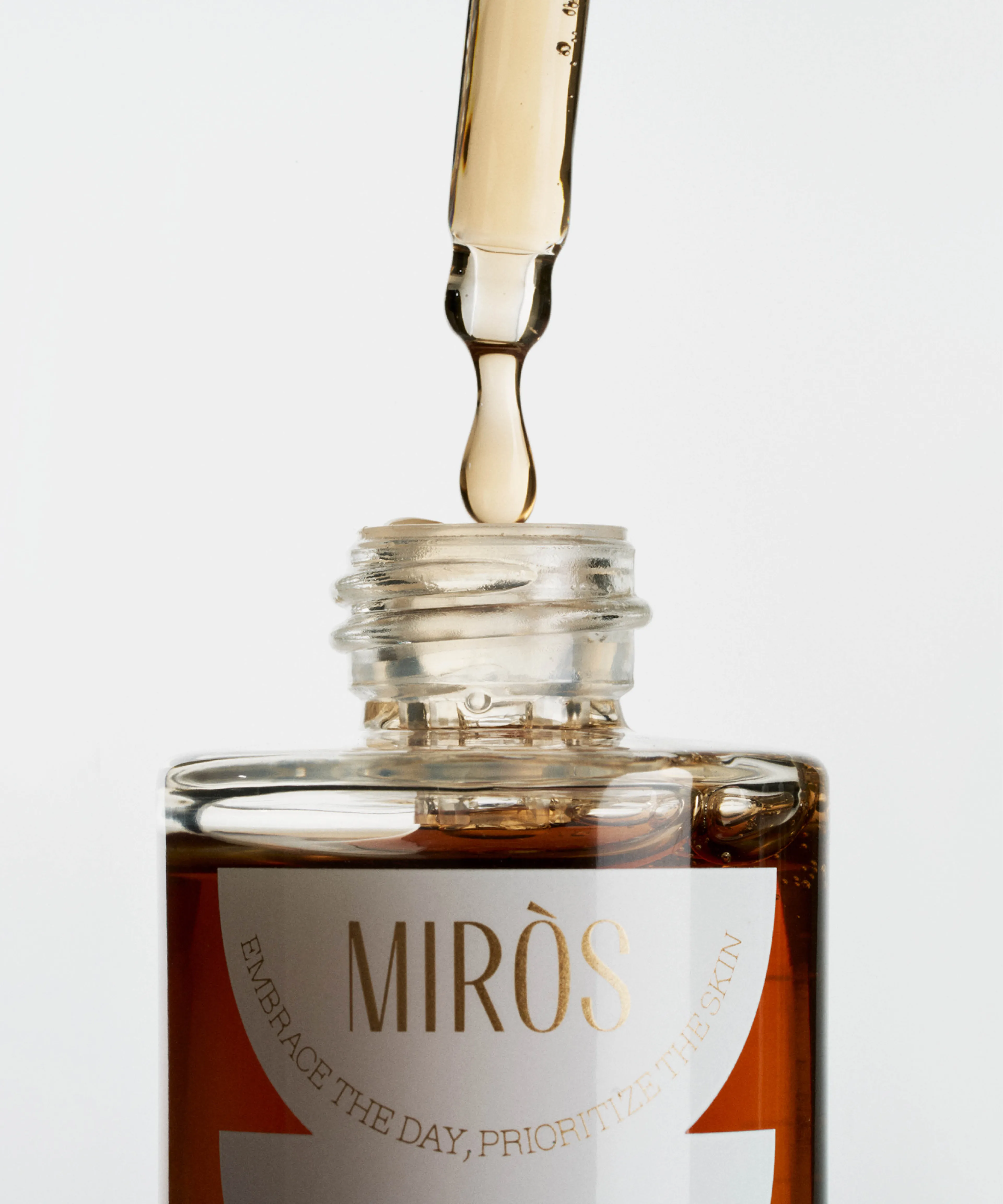
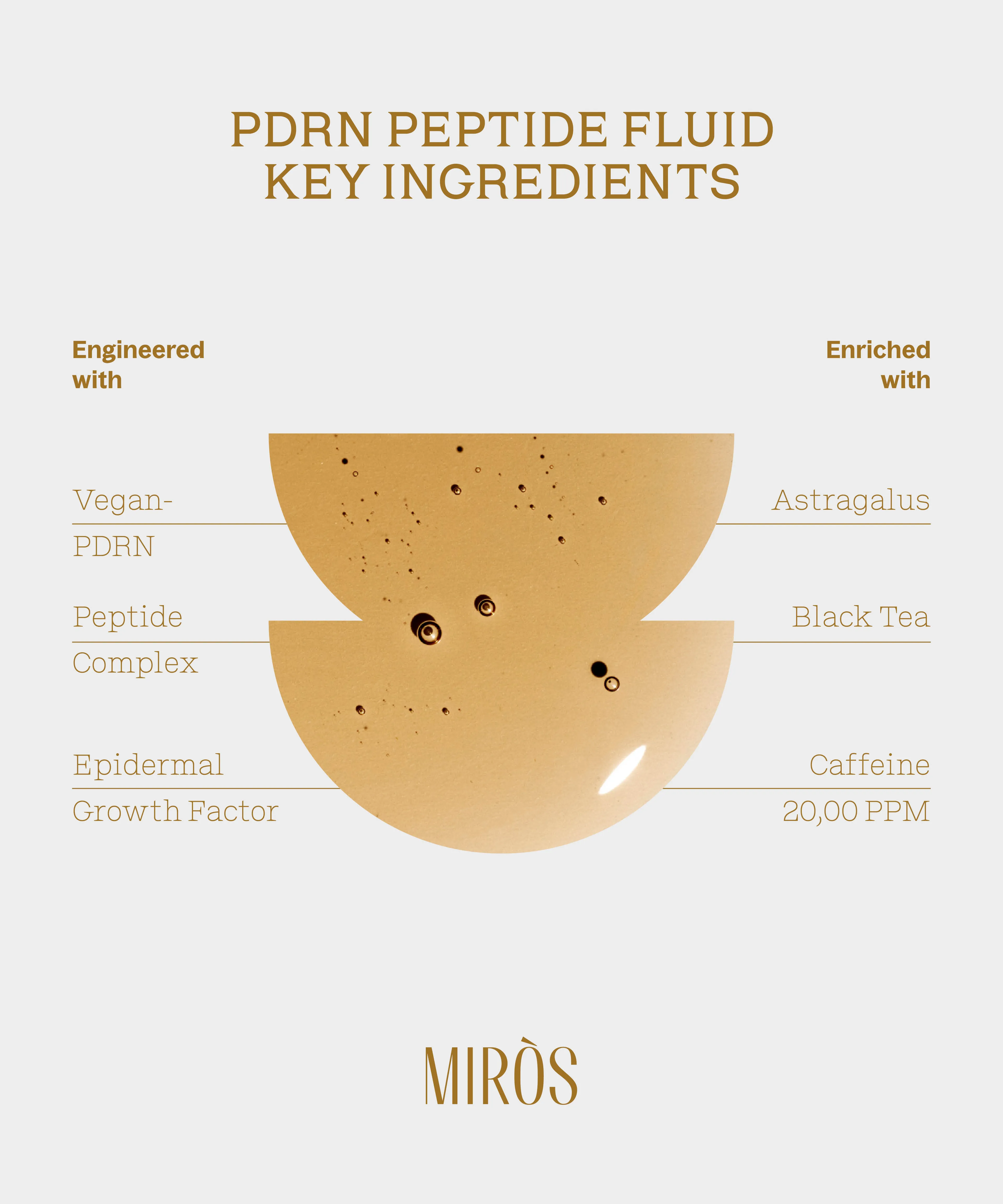
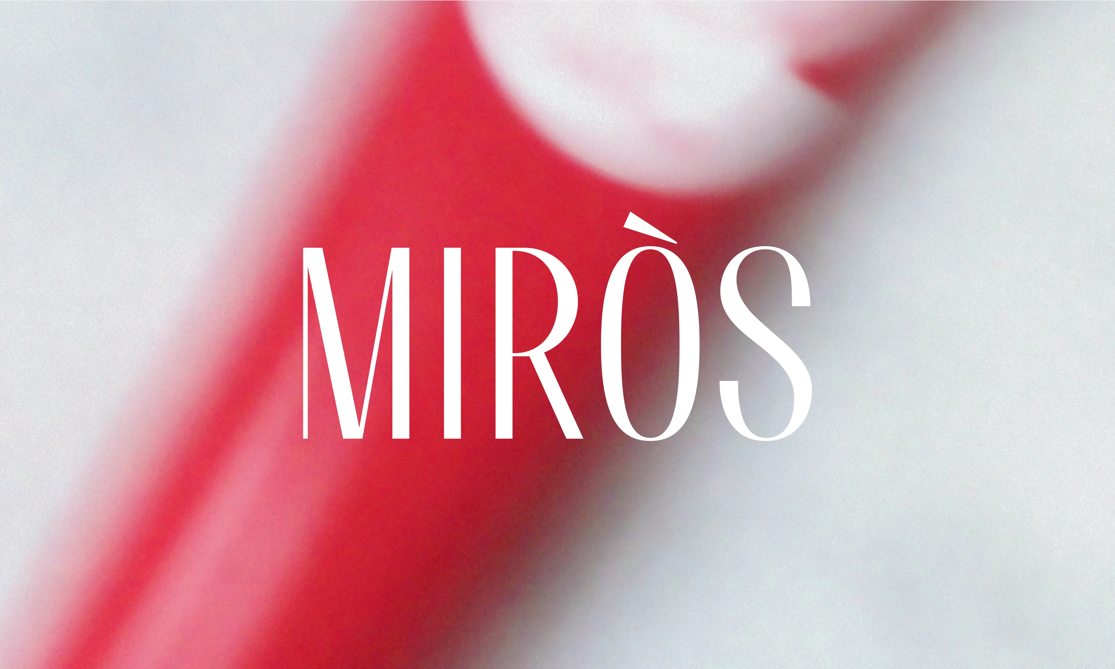
Adding another Beauty brand feather to our creative hat, Miròs is a skincare brand formulated in Korea. To craft Miròs’ essence into its identity, we created a logotype that is highly contrasted and condensed, representing the finesse and elegance of Miròs’ universe. To accompany it, we designed a symbol. A dual graphic element, representing both the sun and an eye, applied across packaging and mirrored in the label shape. Rolled out across communication assets, it becomes a window into product texture, offering a glimpse of Miròs’ sensorial self.
